Designing Websites That Feel Premium
Breaking down typography, spacing, motion, and layout systems that increase perceived value.
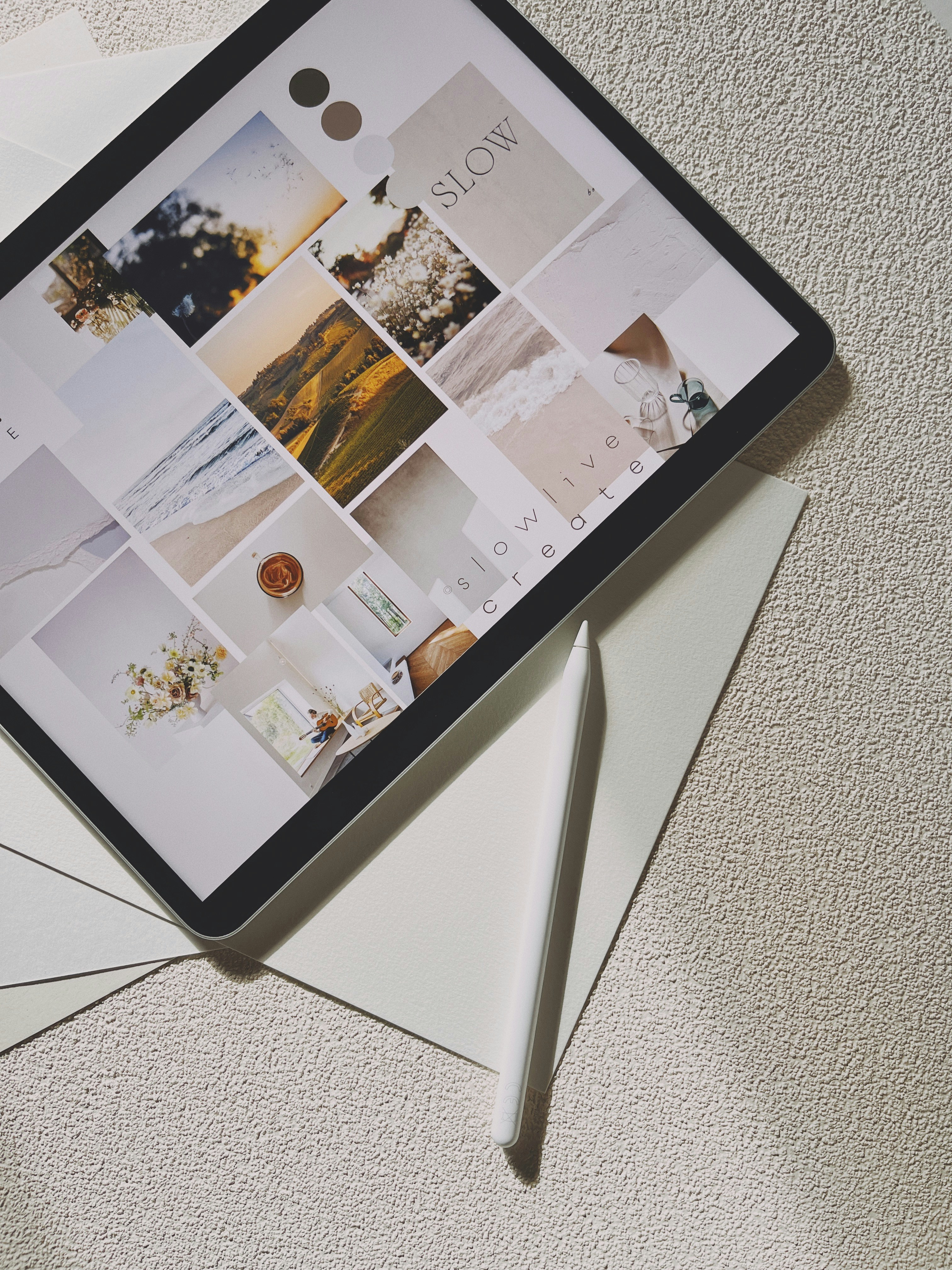
Premium websites are not created through visual noise or excessive effects.
They are built through restraint, clarity, and intentional hierarchy.
Typography is the foundation.
Large headlines, strong spacing, and readable layouts instantly improve perceived sophistication. The best websites prioritize structure before decoration.
Spacing creates rhythm.
Generous white space helps users focus on content and gives interfaces a more editorial, luxurious feel. Crowded interfaces often reduce trust and overwhelm visitors.
Motion should support storytelling rather than distract from it.
Smooth transitions, hover interactions, and subtle kinetic effects create depth and modernity without harming usability.
The strongest premium websites combine simplicity with confidence.
Every visual decision should feel intentional, from CTA hierarchy to navigation behavior and responsive interactions.